
Have you ever landed on a page and closed the tab right away? That’s landing page design working against the brand. In my 6+ years of landing page design services for SaaS and e-commerce. I have seen and learned one of the hardest truths. Things you put above the fold matter more than the content of the page.
It decides whether a random visitor stays or leaves in 5 seconds, before even reading a single word. So what to put on top of your landing page to make visitors stay?
Here’s the direct answer: Put a clear headline, supporting subheadline, one primary CTA button, a relevant hero image or video, correct navigation, and trust signals. Get these six things correct and see your landing page working like a charm.
Everything above the fold either earns a scroll or loses a visitor.
So let’s break down the design agency’s secret recipe.
What is the hero section of a landing page?
A hero section is everything you see after entering a web page without scrolling. Nielsen Norman Group’s extensive research on user attention has discovered that Internet users decide whether a page is worth their time within seconds of landing.
Every year, that window keeps shrinking as TikTok and Reels shorten users’ attention span.
If done correctly, the hero section can become the most valuable selling factor on landing page websites. Because a good UX design does a better job answering that one question: “Is this for me?”
1. Headline: What should it say?
Your headline should state the outcome and benefits; never stuff feature names.
Think about it this way. “AI-powered workflow software.” What does that even mean?
Now check “get your inbox to zero by Friday.” This is what visitors want.
That’s the gap between a feature headline and a beneficial headline, and this is the core thing that most landing pages lose visitors.
Keep the headline short. Aim for under 10 words. A tight headline forces clarity and strips out the jargon that confuses a first-time visitor.
2. Subheadline: Do you even need it?
Yes, almost always. Subheadline does what the headline can’t. It adds context.
Headlines always struggle to relay brand messaging and keywords at the same time. Subheadline fills that gap.
If your headline makes a big promise, the subheadline should explain how your product will deliver. Or who it’s built for. Your subheadline should answer three questions in under two seconds:
- What is this?
- Who is it for?
- Why should I care right now?
3. CTA: How to place them?
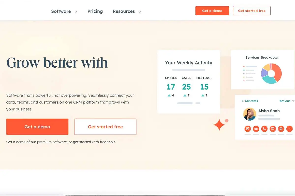
Your primary CTA or call-to-action belongs above the fold, full stop.
We’ve tested this across hundreds of landing pages. A single, focused CTA always outperforms a hero with three or four competing buttons. Good landing page design treats choice as a cost, not a feature. More buttons usually mean fewer clicks on any one of them.
A few rules everyone should follow:
- One primary CTA in the hero area.
- Use action language “Start my free trial,” not just “Submit.”
- Make it visually dominant through color contrast, not size.
- A secondary, lower-commitment link, “See how it works,” is fine if it doesn’t compete visually.
4. Navigation: Who is it for?
Many are still confused about whether to put navigation at the top or not. For a dedicated landing page built around one campaign, the answer is no.
Benchmark data from conversion platforms like Unbounce has repeatedly found that landing pages without a navigation menu convert better. Because for campaign pages, navigation is just a distraction. Every header link is a door to exit.
If a visitor can click to your blog or About page, some won’t be coming back. However, this only applies to standalone landing pages, not your website’s homepage.
5. Hero visual
One question keeps repeating when discussing: what kind of hero visual works best for a landing page, video, or image?
The answer is: be unique. Skip the generic stock photo of people shaking hands. It says nothing about your offer. The hero visuals that tend to perform best fall into a few categories:
- The outcome shot: What the visitor’s life or business looks like after using your product.
- The product in action: A real dashboard, interface, or service being delivered.
- A real person: A genuine founder or team photo for building trust faster.
- Social proof: Logos, ratings, or user counts displayed prominently
Whatever you choose, the visual should support the headline, not distract from it.
6. Trust signals: Where do they belong?
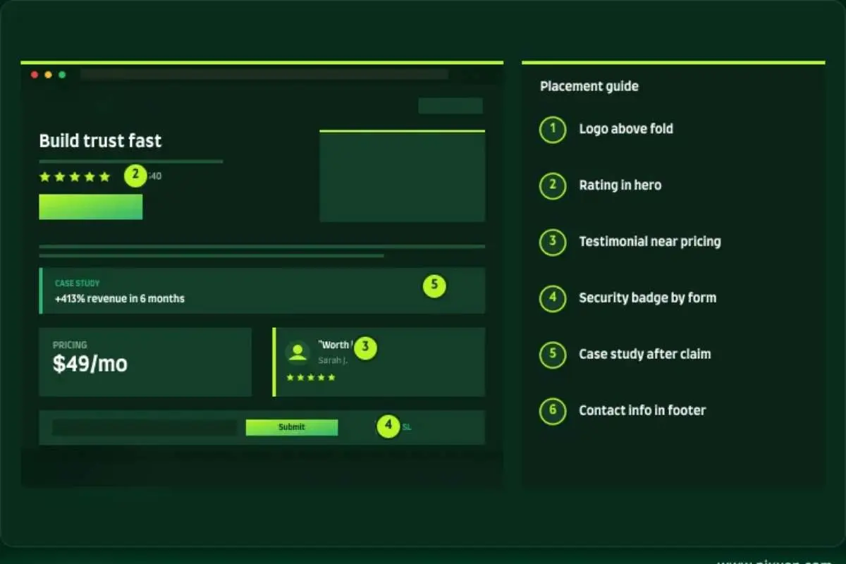
Trust signals above the fold or below the fold are another thing that confuses founders. To make it simple, if you have a strong trust signal, then the answer is YES. A prominent client logo, star rating, or a “trusted by” line can sit right under or above your CTA without feeling messy.
Social proof is a great trust builder. It works because people like to follow others, and trust other people more than they trust a brand talking about itself. A short trust line above the fold lowers the guard visitors naturally raise on an unfamiliar page.
To sum up
The top of the page carries more weight than any other section on the site. It determines whether a visitor will convert or leave. The whole point of landing page design is not only nailing the design. A great landing page is a combination of things.
Headline, subheadline, CTA, and hero visual, navigation when it’s needed, and trust signals come together to make the difference.
What’s sitting at the top of your landing page matters. Check it against this list today, and small fixes here can move the needle more than a full redesign.