As more people turn to the internet and electronic gadgets for their source of information, you can expect data to increase exponentially daily. Data is a result of sharing, collecting, and transmitting information.
Technology is rapidly growing, and more devices are created to contain large memory space to store, process and analyze data sets. With diverse information available, data analysis and visualization are necessary.
Data visualization in Microsoft excel is a data science skill. This skill translates information into graphical representations such as charts, maps, or graphs.
This article will discuss data analysis and visualization and how to use Excel to carry out these tasks?
Let’s learn the art of data visualization in microsoft Excel for Mac users:
1. Defining Data Analysis
Data analysis helps businesses find answers to some complex questions. These answers provide them with knowledge on how to make better decisions to improve their business.
Data analysis determines the company’s financial performance, competition, and marketing opportunities. Data analysts create visualizations to better communicate their message to their target audience. Creating Data visualization in microsoft excel is a key step for successful data analysis.
2. Microsoft Excel Spreadsheet for Data Visualization and Analysis
Microsoft Excel is a powerful and popular spreadsheet program. It is a go-to program for most people for data organization, visualization, and analysis. Excel is constantly being improved and updated to keep up with the changing demands of users. Earlier versions of Excel are only available in desktop version. Now, you can use Excel on your desktop, mobile phone, or online. You can even use an Excel workbook on Mac computers.

A scenario manager is a built-in data analysis tool in Excel. It saves the values encoded in the spreadsheet and can automatically substitute them on your worksheet. This allows you to create and save groups of values as scenarios. You can switch from one scenario to another to view the different results of the analysis.
3. Choosing and Creating the Right Data visualization in microsoft excel Spreadsheet
Choosing the best chart type for reports is challenging even for expert visual communicators and Business Intelligence analysts. The chart you choose largely depends on the type of raw data, the size of the data set, and your intended target audience.
Visualizing data is easy to do, and you can master quickly. The first step in visualizing data is to create your spreadsheet. An organized spreadsheet includes labels and final data sets.
Next, select and highlight the data set with the labels you want to include in your visual. You can then choose the chart type suitable for your data by selecting Insert from the main menu. The visualization automatically appears on your spreadsheet after you’ve chosen a chart type.
You can customize and edit the chart labels by right-clicking on the chart or graph. You can change the color, title, and axes labels.
4. Excel Chart Elements and Visualizations
Microsoft Excel charts are an effective way of presenting and communicating Excel data. Excel has several chart types and visualization tools that transform raw data into effective and visually appealing spreadsheets.
Creating charts brings life into your data, making it easier to understand, visualize, analyze, and share with your target audience. Below are some of the common chart types for different data visualization in microsoft excel needs.
1. Column and Bar Charts
These chart types make use of vertical and horizontal bars to display data. This is used to compare values of different categories.
2. Line and Area Charts
Line and area charts are used for depicting trends over a certain time period. It uses lines or filled areas to display data.
3. Waterfall Chart
TThis chart type uses columns to display data and is color coded to represent the positive values from negative values. The waterfall chart visually presents a starting value and how it becomes the final value by applying various functions such as addition and subtraction. This is ideal to use for illustrating changes in bank transactions.
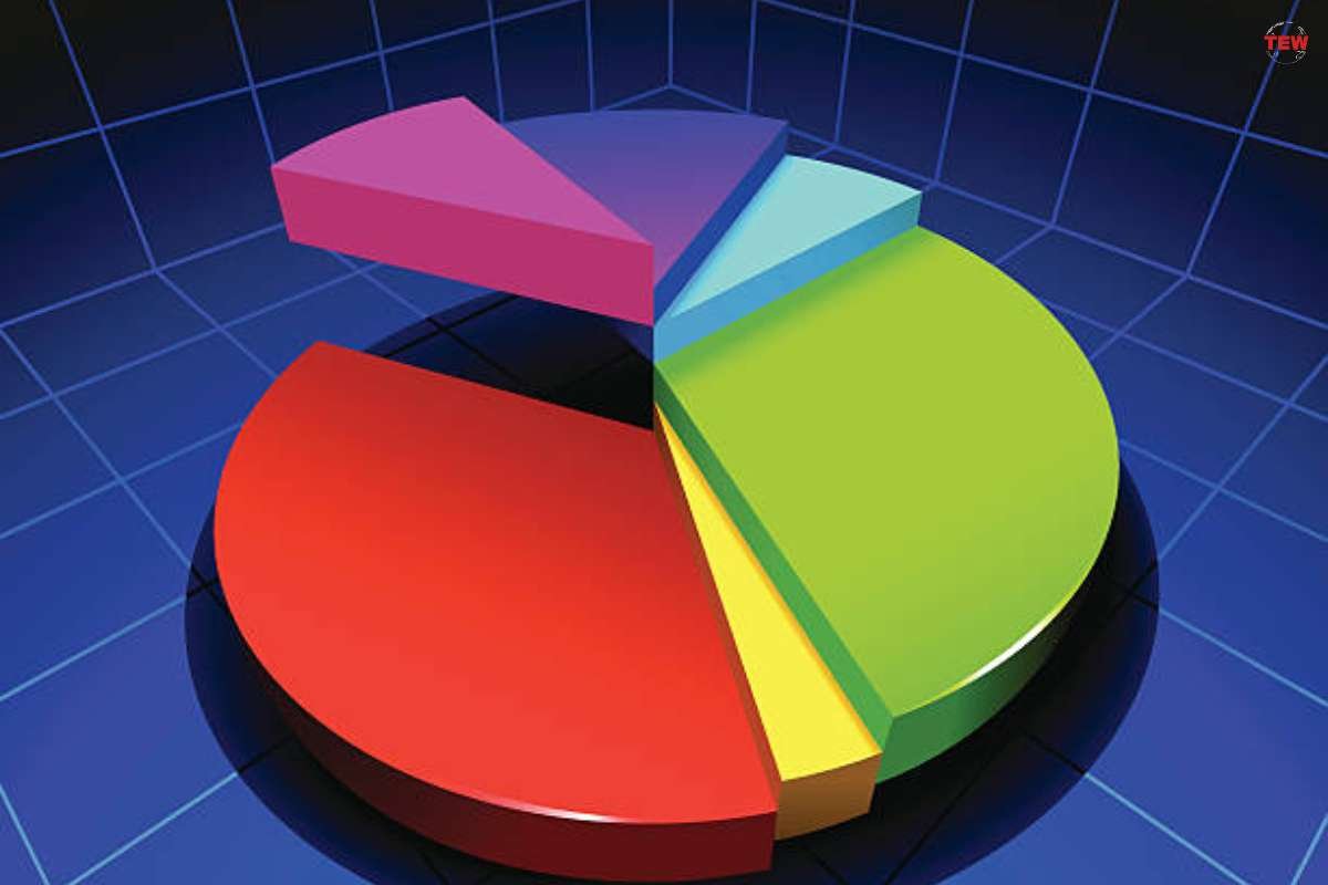
4. Pie and Doughnut Charts
Both the pie and doughnut charts are used to illustrate portions of a whole. Segments of a circle are used to display data.
5. Scatter and Bubble Charts
You may use the scatter and bubble charts to show the relationship between 2 or more variables. These charts use points and bubbles to display data.
6. Histogram and Box Plots
Histograms and box plots make use of boxes or bars to display data. These are used to show statistical summaries or frequency distributions.
5. Excel Pivot Tables and Pivot Chart
Excel Pivot Tables and Pivot Charts are powerful data analysis tools that can summarize and analyze large data sets. It organizes data hierarchically and presents data in a visually appealing way.

Pivot Tables and Pivot Charts can help you manipulate data using a drag-and-drop action. Analyzing data through these visuals can identify trends and relationships that exist within your data.
6. Pivot Tables
Pivot tables summarize and organize large volumes of data for analysis in a structured and hierarchical manner. Pivot tables can perform data filtering, data aggregation, and cross-tabulation.
You can create pivot tables by selecting the data you want to analyze. Click the Insert tab and choose Pivot table. You may use the Recommended Pivot Tables feature for suggestions. You can organize your data by dragging fields from the field list to columns, rows, and filter areas.
7. Pivot Charts
Pivot charts are dynamic and interactive charts. Pivot charts help visualize complex data in a visually appealing manner. They can also manipulate data like Pivot tables, allowing you to create and customize various data views. You can change the layout and appearance.
You can create pivot charts by clicking on the pivot table you wish to create a chart for. Then, click on PivotCharts found in the Tools of the PivotTable Analyze tab. You may then choose a desired chart type.
Final Thoughts
Data visualization in microsoft excel can address several business questions and help make informed decisions. Choosing the right visualization can be an effective means of sharing information with your target audience.
Learning the art of data visualization in Microsoft Excel for Mac is essential. Whether you are using Microsoft or Apple, you can create effective spreadsheets. It can be challenging at first, but with practice, you can master the art of data visualization and transform data into compelling visual elements.